We live in a world where everybody is paying attention to typography – not just graphic designers. Typography, a design aspect previously overlooked in favour of imagery and colour, has taken the forefront in the way people look at any kind of design. How do we know this? Well, people have become adamant that Comic Sans is sub-par, and trendy typefaces are being used to identify brands both large and small.
Because of this, there’s been a massive resurgence in typefaces that we thought were long forgotten. In particular, the ’80s typography scene which was ruled by designers, plastered iconic typefaces across pop culture, only for them to be hidden by the blissful ignorance of the general public. Now, as people grow nostalgic and look to the past for inspiration, the typefaces from these book covers, movie posters and even political campaigns are getting the public appreciation they have long deserved.
Don’t believe us? Check out these examples of typefaces that had a massive peak in the 1980s (whether they were designed then or earlier). You’ll be sure to recognise at least a few from some of this decade’s biggest industries.
Futura
Futura was a modern design of its time in the 1920s and was the iconic German typeface for many years. It survived Nazi Germany, who tried to get rid of sans serif typefaces – what!? The sharp edges and geometric shapes of Futura gave it an international quality that went on to take the world by storm. In the ’80s, Futura was still widely used as a strong, readable corporate typeface. It was donned on official documents all over the world and even features on the plaque that sits on the moon.

Today, you may recognise Futura from the iconic streetwear brand Supreme, the white, italicised, and bolded version Futura displayed prominently inside a red box is plastered on all of their collateral. The adoption of Futura by the streetwear industry has given it a lot of social clout among young people and is now commonly used for many modern fashion and e-commerce brands.
Benguiat
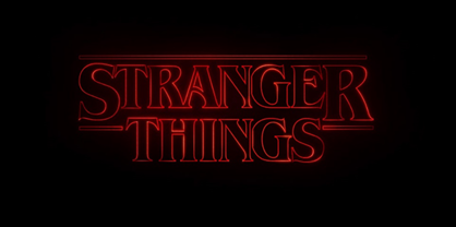
This uber-popular and thick serif is the nostalgic font you may recognise from the iconic Stranger Things opening sequence (cue low-fi synthwave background music). The makers of this title sequence deliberately used the font to enhance the homage to the 80s that the entire show represents.

Stranger Things has been a pop culture leader in bringing back the ’80s life and style. There’s been a rise in ’80s fashion styles, music genres and even the game Dungeons and Dragons since the show first aired in 2016. It’s no surprise that this font has been another one to be adopted by trendy brands Pinterest-wide.
Historically, Benguiat was an incredibly common font in the 1980s, mainly used as a title font for book covers and building signage. Many heritage commercial buildings will feature Benguiat on their original signage, and – to connect it even more to Stranger Things – it’s also the typeface that features on the Second Edition of the Dungeons and Dragons Players Handbook.
Avant Garde
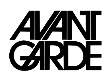
Avant Garde has a long and interesting history. It was designed to be a display font that generated more interest than all the other sans serifs that were coming out around its time (Helvetica, Century Gothic, Akzidenz-Grotesk to name a few).

The font features open, geometric shapes similar to Futura, but it’s defining features are the adjacent diagonals and straight verticals that donned the A’s and M’s of the typefaces. That, and the beautiful dance that the letters seem to partake in to fit together so perfectly.
Avant Garde became popular as soon as it was designed in the 1970s. Herb Lubalin created it to be a display typeface for the similarly-named popular magazine ‘Avant Garde’. Today, it is most popular in modern time as a logotype fit for an array of industries. Its open lettering has created the perfect structure for the logo of the TV show ‘Glee’ and the lowercase version can even be seen on the iconic sportswear logo for ‘Adidas’. It is also commonly used as a display type in magazines, as was its intended design.
Cortez
Last but not least, the Cortez typeface is distinctively recognised as the ‘Stephen King’ type – as it’s written in on the cover of all his books. If you focus on the details of this gothic serif, you’ll see the chunky, triangular edges that set it apart. These shapes serve as a cornerstone of some of the trendiest typefaces used today.

A recent design example of this kind of typeface to come out of the New Zealand design industry is the Cazador Recipe Book. The publication, designed by Seachange, utilised the classic sci-fi typeface in a new setting to give the same, brutalist effect to the recipe book – causing viewers to see the typeface in a whole new light.
So what made typefaces cool again?
The reason we’re seeing a resurgence in typefaces from the ’80s is simple. We look to the past to inspire change for the future. Using retro typefaces in new and challenging contexts can make bold, stand-out statements both on the surface and deeper within the theory of the design. Whether they are used in homage to a simpler time, to make reference to a similar situation in a new way, or simply because they look practical, these typefaces have come back to serve a multiple range of purposes in various industries.
Typefaces come in and out of circulation all the time, and it won’t be long before another era of type becomes trendy once again (my bets are on Wingdings). If there’s anything to gain from this, it’s that in order to keep up with trends, one sure-fire way to do so is to keep looking to the past.
Zizacious is full of inspirational content that’s constantly new and exciting. Subscribe to our newsletter if you’re interested in staying up-to-date with design, life and much more.


